Articles
Triangles And Trends

Building positions is an essential exploitation of a successful trade, and triangle formations can be key to doing so. The classic technical trader relies upon various chart formations for determining market tops, bottoms, and consolidations. Although the triangle chart formation can be a trend reversal or a consolidation, I want to show you how to use it as a continuation pattern, how to identify it as it develops, and how to trade it. What are triangles? They are simply sideways trading action, with the widest part of the correction occurring earliest in the development of the pattern. As the market marks time, the trading range narrows, forming the shape of a triangle.
INTRO
Why do triangles occur? According to the classic tome Profits In The Stock Market, by H.M. Gartley:
The most logical explanation appears that the period of formation of the triangle reflects an uncertain state of mind and a re-appraisal of the situation. During this time, all buyers and sellers are gradually influenced, by economic and statistical factors, to withdraw from the market. As a result, fluctuations narrow down and volume of trading diminishes until a new impetus affects the market. Prices often move out of this state of equilibrium as a result of news which is interpreted as important marketwise.
Triangles are easy to see in hindsight, but with a little quantification, I can define a technique to spot a triangle as it first develops. That way, you’ll have the chance to trade the triangle as it’s developing. To outline a triangle, there are two trendlines to draw. The upper trendline, which is referred to the supply line, represents resistance. The supply line represents a lack of conviction by the buyers to commit more funds to the market, and because of that, there is enough profit-taking and short-selling to turn prices back down.
The lower trendline is the demand line and represents support. Here, the buyers come back out in force and turn prices up again. The key to drawing the correct trendlines is the use of a three-bar pattern referred to as isolated highs and lows. (See sidebar, “Isolated highs and lows.”) These patterns are simply attempts by the market to move in one direction; the second bar’s high is the highest point for the isolated high, and the second bar’s low is the lowest point for the isolated low.
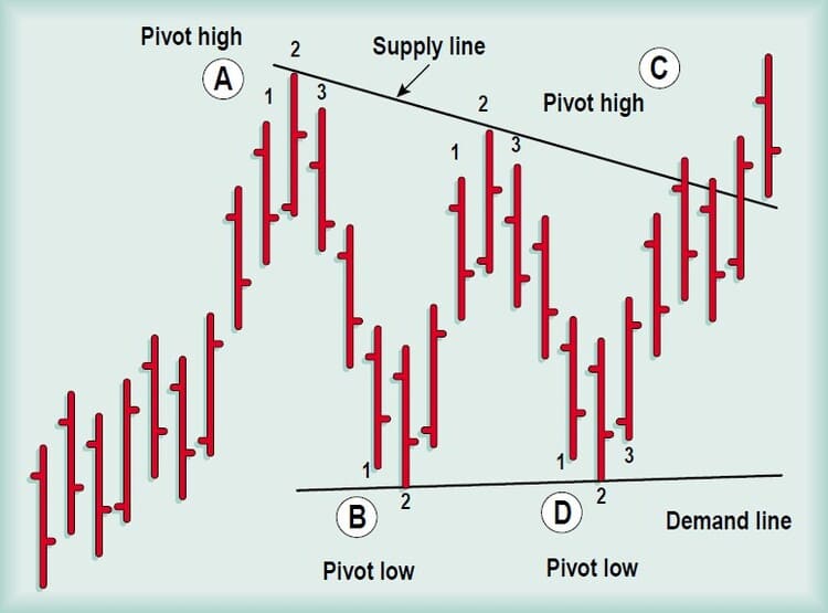
FIGURE 1: TRIANGLE. To draw a triangle, you need a supply line and a demand line. Use isolated highs and lows to determine the support and resistance points.
So when a market is in an uptrend, the first isolated high (Figure 1, point A) warns us that the upward trend may be stalling. That’s just a warning. The first isolated high marks a momentary peak, and a countertrend move may follow. If the pullback occurs, I look for an isolated low (point B) to form during the decline. This isolated low will mark the completion of the first leg of the triangle. Here, the selling has waned enough that both new buyers and short-covering will push the market back up. After that, the market will advance again, but that won’t take out the first isolated high. At that point, a second isolated high, lower than the first, unfolds; the supply line can then be drawn. This supply line can either be horizontal or declining.
A triangle is not formed until the next isolated low, the fourth point, has formed. (The next decline should not pass below the first isolated low.) Once this isolated low occurs, I can draw my demand line. The demand line can be horizontal or rising. To be a proper triangle, the two lines must converge when extended. As a rule of thumb, measure from the first isolated high to the right where the demand and supply lines converge, and often the market will emerge from the triangle approximately two-thirds of the way to where the lines converge. So once I have drawn in the supply and demand lines, I wait for the market to penetrate either the supply or demand line.
Naturally, I would have an advantage if I had any idea which line would give way. Since I’m looking for continuation patterns, one solution would be to look for the leaders in a bull market. Once I find them, I can anticipate whether the supply line will give way and the price of the stock enter into a new uptrend.
TAKING ACTION
The first step to determining the current market leaders is to narrow the universe of possible candidates. There are many ways to locate strong stocks. One technique is to review Investor’s Business Daily and take a look at the holdings of the top-performing mutual funds. In doing so, you will find the companies that have been propelling the mutual funds to the top of the performance lists. Most of those companies will have high rankings based on IBD’s scale for earnings per share growth and relative strength. These mutual funds have committed resources to pick strong stocks, so this list of holdings is a good place to start.
Once I have a list of candidates, I narrow it further by using a multiple time frame technical analysis approach. The foundation of this technique is to analyze two different time frames, such as weekly and daily charts. You can use any method of your choice to determine the trend of a higher time frame, and then trade based on signals in concert with both trends.
For example, if you are trading daily bars, look to the weekly bars for the trend. You could use a simple moving average concept to do so; if the eight-week moving average is rising, then the trend will be considered up. With that, you can use triangles on the daily bars to enter into new positions as well as adding to existing ones. One stock that has shown up on IBD’s leading-funds guide is Sun Microsystems [SUNW]. Both the earnings per share and the relative strength rankings have been running in the 90s. Clearly, this should be a popular stock with both the momentum player and the managers of growth funds.
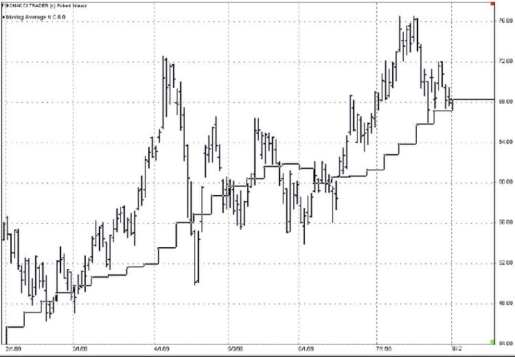
- FIGURE 2: SUN MICROSYSTEMS, STEP FORMATION. The line drawn in a step formation is the eight-week moving average plotted from a Friday-to-Friday- close on the daily bars. The eight-week moving average is one time frame higher than the daily bars. For most of the first part of the year, the weekly moving average was in an uptrend.
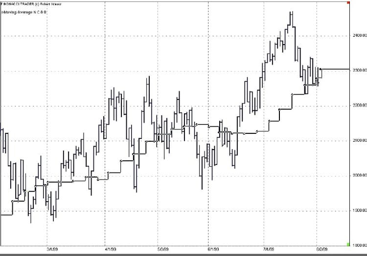
- FIGURE 3: NASDAQ 100, EIGHT-WEEK MOVING AVERAGE. This chart also has the eight-week moving average plotted on the daily bars. The trend was up here for most of the first part of the year.
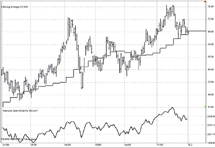
Looking at Figure 2, which is a daily chart with an eight-week moving average plotted in step formation from Friday-to-Friday’s close on the daily bar chart, I can see that the eight-week moving average for SUNW had been rising at a fairly steady rate. I then compare that performance to the Nasdaq 100 in Figure 3 over the same period.
Note that the moving average for the Nasdaq looks similar. To get a clearer picture of the comparison between the two charts, I look at a relative strength comparison of the two price series in Figure 4. Here, the bottom line is a relative strength line, and you can see by the higher peaks that SUNW was outperforming the Nasdaq, a positive sign.
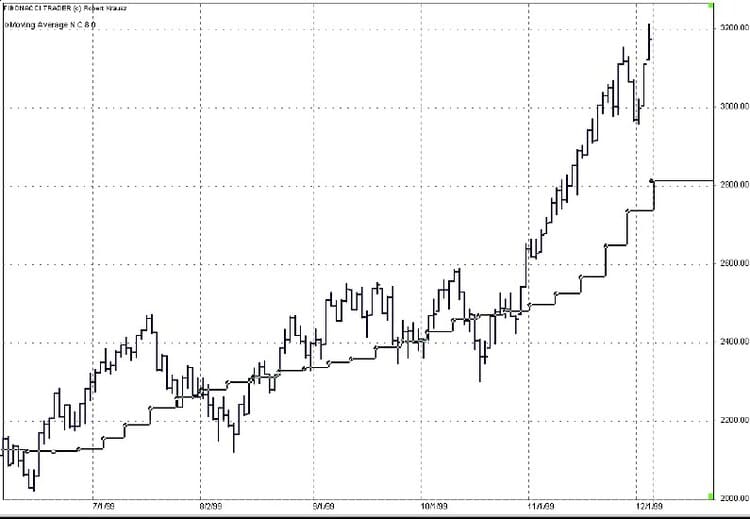
- FIGURE 5: NASDAQ 100. The Nasdaq index also was in an uptrend but crossed below the moving average three times.
- FIGURE 4: SUN MICROSYSTEMS, RELATIVE STRENGTH COMPARISON. The bottom line is the relative strength comparison between Sun Microsystems and the Nasdaq 100. The higher peaks by the relative strength line indicated that Sun Microsystems [SUNW] was outperforming the market.
Moving to Figures 5 and 6, I see further evidence of strength. The Nasdaq sold off from the mid-July peak into early August (Figure 5), and SUNW (Figure 6) followed the market down for a little more than a week, then traded sideways, tracing out a double bottom. The October lows in the Nasdaq took out the September lows, but SUNW held well above the September lows.
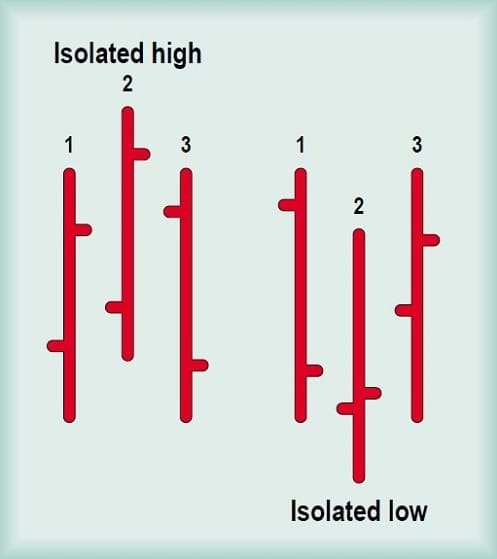
Prices have made three attempts to move in one direction. Isolated highs and lows are minor tops and bottoms. — T.H.
Finally, I note both eight-week moving averages were in steady uptrends, but the Nasdaq traded through its weekly average a number of times while SUNW found strong buying at each touch. SUNW has definitely been a leader during this latest bull phase.
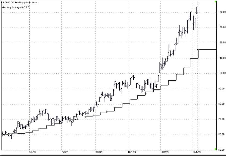
FIGURE 6: SUN MICROSYSTEMS. For the latter part of the year, SUNW persistently stayed above the rising eight-week moving average.
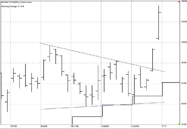
Now that I have identified our leader, let’s look for the triangles that helped this stock stay its course. Figure 7 traces one clear triangle based on my definitions. During the first week of October, the market formed an isolated high. The market declined and formed an isolated low during the second week. Next, after the market advanced and formed the second isolated high in the third week of October, I drew the supply line. Three days later, the market traced out the final isolated low and I drew the demand line.
At this point, I anticipated the breakout to the upside because this stock was still in an uptrend based on the eight-week moving average. Sure enough, on October 28, there was a gap up opening, and the stock took off. My entry point was a penetration of the supply line, with a stop-loss point below the demand line.
- FIGURE 7: SUN MICROSYSTEMS, TRIANGLE FORMATION. During October, SUNW traced out a triangle. You can buy on penetration of the supply line and place your initial stop below the demand line. Move your stop to the trailing moving average once the moving average rises above your entry point.
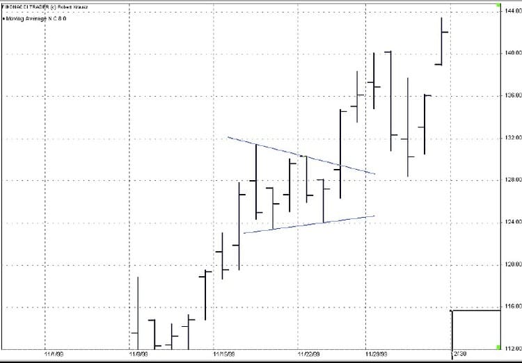
- FIGURE 8: SUN MICROSYSTEMS, DYNAMITE TRIANGLE. Short-term triangles are called dynamite triangles because of their sudden development and exit by prices.
Figure 8 shows a short-term version of another continuation triangle — a dynamite triangle. On November 17, the stock made an isolated high; on November 18, it completed the isolated low, then went up for two days to make another isolated high, back down for one day, and then broke out while completing the last isolated low. This one was tight, but it was another sign of the stock’s strength.
There is a method for setting an objective for the triangle’s breakout. Simply measure the widest point, and then add this amount to the apex of the triangle. Consider taking partial profit at this point. For a longer-term view, after the initial entry point becomes profitable and the eight-week moving average moves higher than the entry price, use the moving average as your trailing stop. This way, if there is a bout of profit-taking or some sector rotation, you shouldn’t be knocked out of a market leader during the correction. If an actual trend reversal is under way, using the eight-week moving average as a trailing stop will keep you from turning a winner into a loser.
CONCLUSION
Use triangles to identify consolidation periods for strong market leaders that are in well-defined uptrends; watch how triangles or other continuation patterns are unfolding. As long as you see the patterns acting as continuation patterns, the overall health of the market is strong. Failures by continuation patterns can forewarn of a more substantial market correction on the horizon.
Finally, always use a multiple time frame analysis. It really isn’t as important about which indicators you apply to the two time frames; just use the trend of the higher time frame to determine the trend and then trade your time frame of choice based on the trend of the higher one.


