Articles
Channel Analysis
A market does not move in a straight line; instead, its movement travels across the chart in peaks and valleys, forming a channel in the direction of the trend. Early identification of the channels can give you important information, including that the trend has changed direction, what the profit objectives are and risk points.
INTRO
As computers and technical analysis software become more and more sophisticated, there is an increasing reliance by traders on using indicators for trading signals. This focus on using technical indicators for developing trading systems is a reasonable step, but along the way, a certain craft, using simple price charts to gauge what a market is doing, has been lost. But why the movement away from chart analysis?
Once more, the answer centers around simplicity; traders have found that, much to their delight, indicators are easy to program, modify and design trading systems around. There is an additional appeal, because most indicators can smooth the price action and have specified range limits such as zero to 100. This feature gives the trader the sense that noise has been filtered from the markets. The apparent moment-tomoment randomness in a market is due to the market participants therein acting in the marketplace for their own diverse reasons. The result? The underlying price trends are clouded by the impact of these traders. As a result, traders have grown dependent upon indicators that filter the price action and produce reliable trading signals.
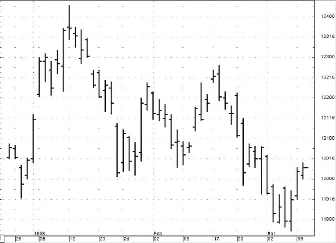
- FIGURE 1: MARCH 1998 T-BONDS. The intraday fluctuations shown on the open-high-low-close bar chart for the T-bond contract are important, but often the highs and lows represent momentary extremes. The closing price represents the bottom line for the day’s activity.
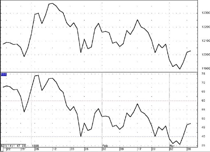
- FIGURE 2: CLOSING PRICE AND RELATIVE STRENGTH INDEX. Here’s the March T-bond contract with a 14-period relative strength indicator (RSI) plotted below. The normalization step in the RSI calculation creates a range of values between zero and 100, effectively restricting the values. The RSI mimics the closing price. Any indicator that uses the closing price is a filter of the daily bar’s activity.
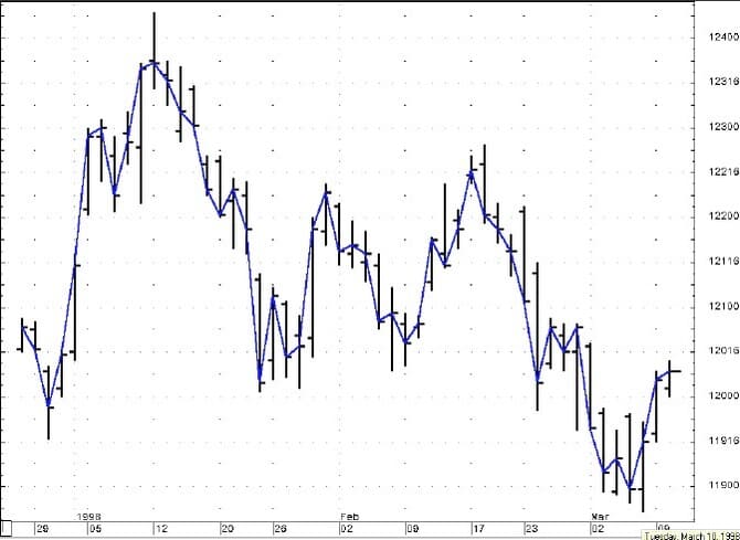
For example, Figure 1 is an open-high-low-close bar chart for the Treasury bond contract. The intraday fluctuations are important, but often the highs and lows represent momentary extremes, whereas the closing price represents the mark-to-market accounting for portfolios and is really the bottom line for the day’s activity. Most daily technical indicators also use the closing price for calculations. In fact, try using your favorite indicators plotted in one window with just the closing price plotted above. Figure 2 is the closing price for the March T-bond contract with a 14-period relative strength index (RSI) plotted below. The normalization step in the RSI calculation creates a range of values between zero and 100, effectively compressing the values, but you can see how close the RSI mimics the closing price. Any indicator that uses the closing price is a filter of the daily bar activity, because the indicator ignores the intraday noise about the trend of the closing prices. The closing price is an important tool, so I use the closing price as the basis for my chart analysis (Figure 3).
- FIGURE 3: CLOSES PLOTTED. Here, a line is plotted to highlight the closing prices on the open, high, low and close bar chart.
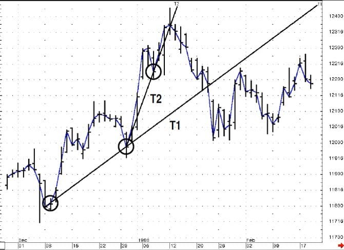
- FIGURE 4: TRENDLINES. Trendline 1 (T1) is the closing price of 118-02 on December 9 to the closing price of 119-28 on December 30. Each closing price is circled. Trendline 2 (T2) is the closing price of 119-28 on December 30 to the closing price of 122-08 on January 7. The break of T2 seems to forewarn of the test of T1, which was also subsequently broken.
MEANDERING WITH A PURPOSE
Studying price charts can be likened to surveying the flow of a river. My trendlines are a line of sight from two points along the river’s bank, and as long as that line of sight is not broken, the river’s direction is parallel to that line of sight. Looking at Figure 4, the March 1998 contract, I’ve plotted two trendlines. Trendline 1 (T1) is the closing price of 118-02 on December 9 to the closing price of 119-28 on December 30. I’ve circled each closing price. Trendline 2 (T2) is the closing price of 119-28 on December 30 to the closing price of 122-08 on January 7.
On close observation, the break of T2 seems to forewarn of the test of T1, which was also subsequently broken. This simple approach can offer a degree of confident analysis, but the technique is incomplete because it does not account for the market’s tendency to ebb and flow. Better information may be gleaned by using a technique that recognizes this tendency to trend in one direction and then move counter to the trend. This is where the application of channel analysis can help.
FOUR UP AND FOUR DOWN
There are four types of trend channels (see sidebar, “Trend channels”), two for upward trending markets and two four downward trending markets. Trend channels connect extreme high and low closes. The first upward price channel will connect a trendline along two lows and then plot a parallel line off of the high close between the two extreme low closes. This will project for you a possible overhead price level, and you should anticipate taking a profit during an uptrend. Once the market moves to a new high, plot a trendline over the two highs and a parallel line along the recent low. This will give you a possible support point for a pullback. Again, I use the closing prices for plotting these lines and watch for the price levels as objectives. Intraday overshoots are common and false exits out of the channel as well, but closes beyond the projected level of support or resistance can offer valuable information.
My trendlines are a line of sight from two points along the river’s bank, and as long as that line of sight is not broken, the river’s direction is parallel to that line of sight.
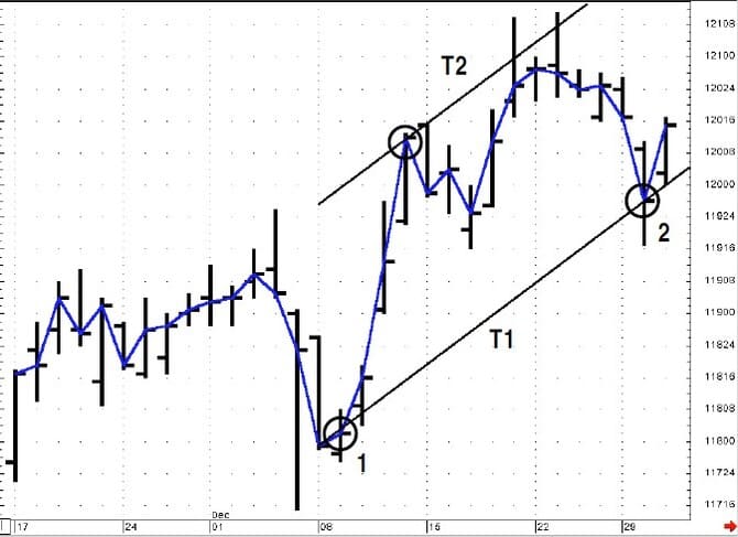
Let’s walk through some trading history using the T-bond contract. Figures 5 and 6 will cover the same period as Figure 4, except this time, we will walk through using trend channels instead of basic trendlines. First, the line labeled T1 is a support line drawn along points 1 and 2. Draw a line parallel to this support line using the closing price between the two support points that is the maximum width from the support line. There are higher value closing prices, but this would create a narrower price channel. Now we have a reasonable price objective. If the market reaches this point or exceeds it, then you can conclude that the market is still in an uptrend, and exceeding the resistance line is evidence of a great deal of demand. Likewise, the failure to reach this upper line may be a warning of near-term weakness.
- FIGURE 5: TREND CHANNELS. This is the first half of Figure 4. The line labeled T1 is a support line drawn along points 1 and 2; next, draw a line parallel to this support line using the high closing price between the two support points that is the maximum width from the support line. Exceeding the resistance line is evidence of a great deal of demand. Likewise, the failure to reach this upper line may warn of near-term weakness.
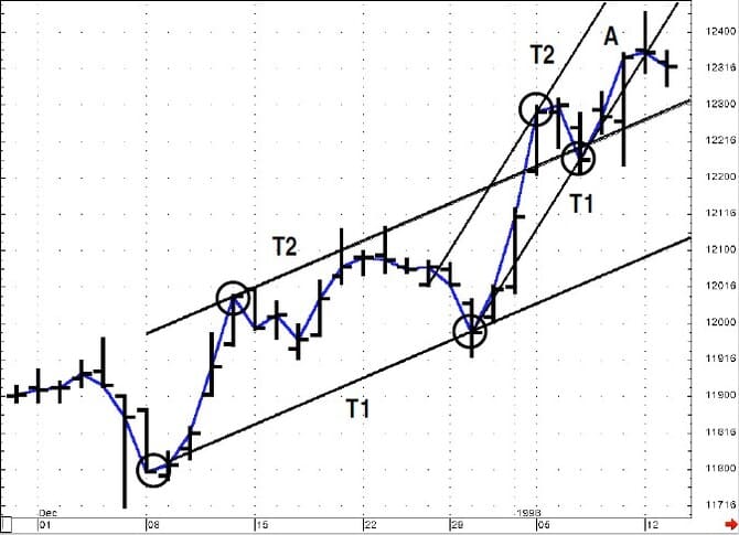
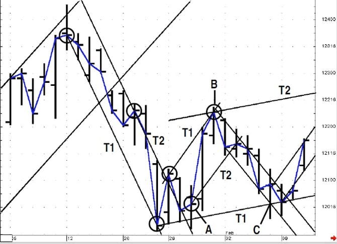
- FIGURE 6: NEW HIGHS. With the market’s rally to new highs, the same steps are applied to the same chart with this updated information. The price barely moved toward the new resistance line (A) and then closed to the right of the new support line. This market weakness indicates that the latest rally was the exhaustion of the upward trend. A new upchannel should be drawn for analysis.
Figure 6 illustrates that the market did rally to new highs. Next, the same steps are applied to the same chart with this updated information. Note how at the top of Figure 6, the price inched toward the new resistance line and then closed to the right of the new support line. This market weakness indicates that the latest rally was the exhaustion of the upward trend. At this point, a new upchannel should be drawn for analysis.
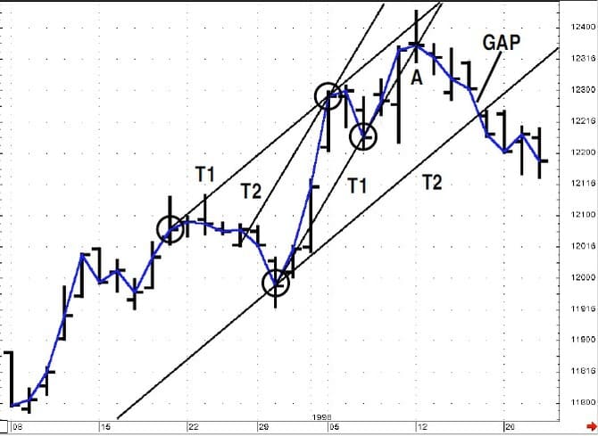
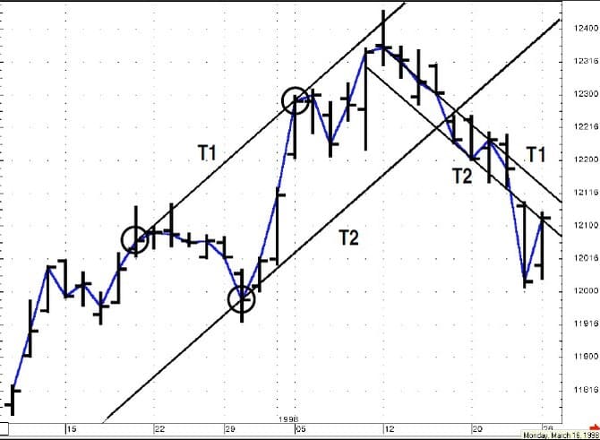
Figure 7 is the new trend channel. The breakdown of the previous channel (T1) indicates a test of the support line (T2), which was indeed gapped past as the market broke the support channel, a very negative indication. At this point, lower prices are to be expected. Figure 8 shows the first channel that can be drawn, and it is a very narrow trend channel. On occasion, this is all that the market will provide, but the continuation within the channel as well as the break through the lower support line indicates continued market weakness.
- FIGURE 7: NEW CHANNEL. The breakdown of the previous channel (A) indicates a test of the support line (T2), which was indeed gapped past as the market broke the support channel, a very negative indication.
- FIGURE 8: FIRST CHANNEL. The first channel that can be drawn is very narrow. Occasionally, this is all that the market will provide, but the continuation within the channel as well as the break through the lower support line indicates continued market weakness.
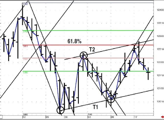
Figure 9 updates with more trading history. On January 28 (point A), the market closed well to the right of the resistance line, which led to a rally (point B), and then the market fell back toward the late January lows (point C). Figure 9 shows the support line drawn along the major low two support points (T1) and a resistance line drawn parallel based on the high point (T2) between the two lows. Figure 10 shows how the market reached this resistance level, exceeded the level and then retreated. In addition, this area was near the Fibonacci 61.8%retracement of the downleg that occurred during January.
- FIGURE 9: MORE CHANNELS. On January 28 (point A), the market closes well to the right of the resistance line, which led to a rally (point B), and then the market fell back toward the late January lows (point C). Figure 9 shows the support line drawn along the major low two support points (T1) and a resistance line drawn parallel based on the high point (T2) between the two lows.
- FIGURE 10: MAJOR RESISTANCE. The market reached this resistance level, exceeded the level and then retreated. In addition, this area was near the Fibonacci 61.8% retracement of the downleg that occurred during January.
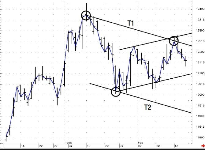
The key issue is the upper channel resistance line, which was drawn four days before the market first reached this level. At this point, a more long-term view of a possible downward channel can be considered (Figure 11). Now check out Figure 12. Note how the selling pressure pushed the market right through the support level established off of the low points established in late January and early February (A), a rather dramatic decline of nearly four full points. When the market broke the lows of January 23, it immediately retraced but did not close or trade above the support line shown along the bottom of Figure 9. This indicated that the breakdown was unlikely to be false.
- FIGURE 11: LONGER-TERM VIEW. At this point, a more long-term view of a downward channel can be considered.
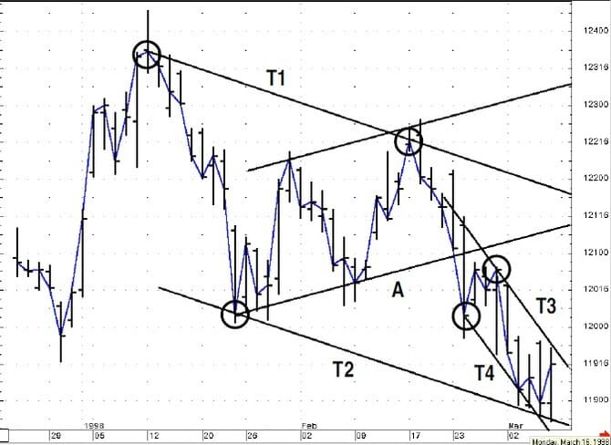
- FIGURE 12: MAJOR SUPPORT. The selling pressure pushed the market right through the support level (A) established off of the low points established in late January and early February. When the market broke the lows of January 23, it immediately retraced but did not close or trade above the support line shown along the bottom of Figure 9. Then the market reached the support level of the downward trend channel defined by lines T1 and T2 in Figure 12. The decline from February 18 to March 6 created a new downward trend channel (T3 and T4).
The market did continue lower, as Figure 12 shows. The market reached the support level of the downward trend channel defined by lines T1 and T2 in Figure 12. The decline from February 18 to March 6 created a new downward trend channel (T3 and T4). Figure 13 shows how this channel was broken, leading to a swift rally back to the original resistance side of the channel (T1).
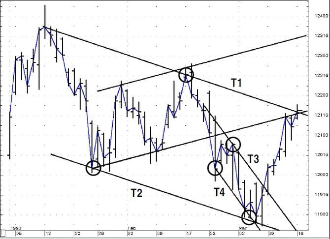
FIGURE 13: RALLY MODE. This latest down channel was broken, leading to a swift rally back to the original resistance side of the channel.
TREND CHANNELS
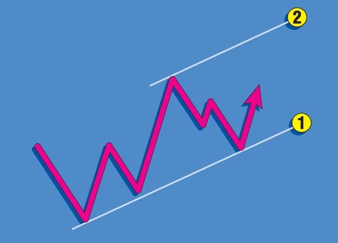
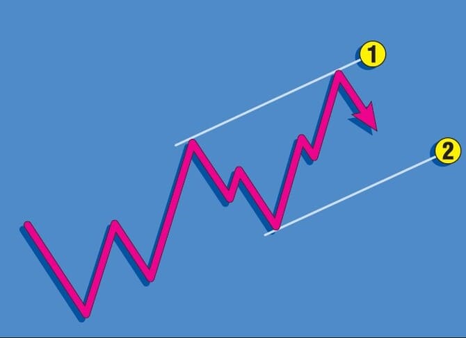
There are four types of trend channels, two for upward trending markets and two four downward trending markets. Trend channels connect extreme high and low closes. Sidebar Figure 1 shows the first upward price channel. Connect the trendline along two lows and then plot a parallel line off of the high close between the two extreme low closes. That gives you a possible overhead price level, and you should anticipate taking a profit during an uptrend. Once the market moves to a new high, plot a trendline over the two highs (sidebar Figure 2) and a parallel line along the recent low. This will give you a possible support point for a pull back.
- SIDEBAR FIGURE 1: UPWARD CHANNEL, RESISTANCE. Identify two low closing prices and draw line 1. Use the extreme high closing price between the two low closes to draw your parallel line.
- SIDEBAR FIGURE 2: UPWARD CHANNEL, SUPPORT. Identify two high closing prices and draw line 1. Use the extreme low closing price between the two high closes to draw your parallel line.
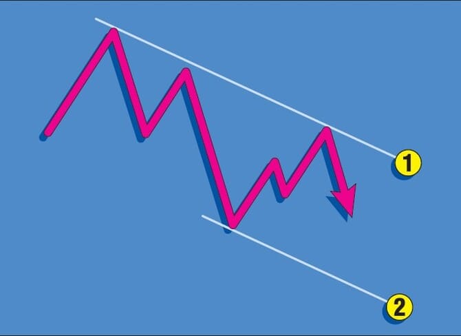
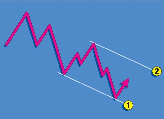
Sidebar Figure 3 shows the steps for a downward channel. Pick the two extreme high closing prices for the resistance line. Plot a parallel downward from the extreme low closing price that is between the two highs. Sidebar Figure 4 shows the steps for the resistance line. I use the closing prices for plotting these lines, and watch for the price levels as objectives. Intraday overshoots are common, as are false exits out of the channel, but closes beyond the projected level of support or resistance offer valuable information. This takes some practice, and there is not always a clearly defined structure. Finally, if there are more than two points that establish the trendlines, such as three touches by the market, then that trendline takes on more significance, especially if it is broken.
- SIDEBAR FIGURE 3: DOWNWARD CHANNEL, SUPPORT. Identify two high closing prices and draw line 1. Use the extreme low closing price between the two high closes to draw your parallel line.
- SIDEBAR FIGURE 4: DOWNWARD CHANNEL, RESISTANCE. Identify two low closing prices and draw line 1. Use the extreme high closing price between the two low closes to draw your parallel line.
HOWEVER…
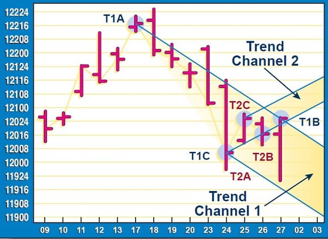
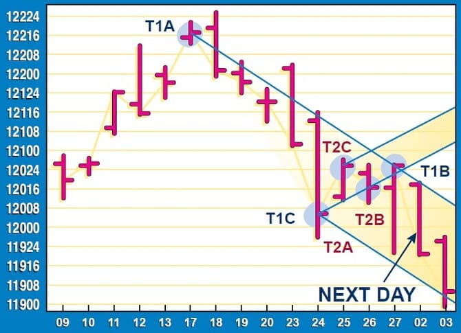
Using trend channel analysis provides two valuable pieces of input for trading: the direction of the trend, and future support or resistance levels. There is one problem, however. How could you, if not know, then at least estimate when a new channel should be drawn? For example, looking at Figure 14, on Friday we can draw two different channels — T1A, T1B, T1C and T2A, T2B, T2C. Recall that we are using closing prices; so how can we estimate an upward channel, such as trend channel 2, which would require a higher close the next day to be confirmed, or a downward channel, such as trend channel 1, which would require a downward close the next day?
- FIGURE 14: JUNE T-BONDS. Which daily channel should be considered the valid one? We can draw two different channels — T1A,T1B, T1C and T2A, T2B, T2C. While we have to wait for the closing price for the final channel, we can estimate what that closing price must be for either channel by extending our channels one more day forward. In this case, the downward channel resistance line would require a close below 120-18 to still be in force. The support level for trend channel 2 is 120-27.
- FIGURE 14: JUNE T-BONDS. Which daily channel should be considered the valid one? We can draw two different channels — T1A,T1B, T1C and T2A, T2B, T2C. While we have to wait for the closing price for the final channel, we can estimate what that closing price must be for either channel by extending our channels one more day forward. In this case, the downward channel resistance line would require a close below 120-18 to still be in force. The support level for trend channel 2 is 120-27.
Even though we have to wait for the closing price for the final channel, we can estimate what that closing price has to be for either channel; simply extend our channels one more day forward. For Monday, March 2, the downward channel resistance line would require a close below 120-18; the support level for trend channel 2 is 120-27. So we have two numbers for the close on Monday. Interestingly, the opening price for Monday (Figure 15), March 2, was 120-18 and the high 120-19. Therefore, early in the trading day we have an indication that the downward channel is the better candidate.
Of course, nothing says that the market can’t reverse intraday and close above 120-27, giving credence to the upward channel. But sitting for six hours with a position waiting for the close entails considerable risk. I have specifically structured this analysis based on closing prices to analyze the market’s technical condition, so it appears that there is an inherent weakness in this approach.
As Krausz explained, “An approach based on multiple time frames uses analysis of a higher time frame, such as the weekly bar chart, to define the tradable trend and important support and resistance bands for the daily bar chart.” In our case, we are using the closing prices on daily bar charts for the analysis. The trend direction, support and resistance levels are all defined by the channels on the daily chart. Applying Krausz’s logic to our situation, we have to drop to an intraday format for our trading signals. In this case, I recommend looking at 40-minute bars for our trading signals.
I used 40-minute bars simply for personal preference. You can use any number of minutes per bar you choose; just make sure it divides the daily trading hours into an equal number of intraday bars. At this point, we know that we have trend direction as well as support and resistance levels based on the trend channels from the daily chart. So now the problem turns to the selection of which technical method to employ at appropriate points in time based on the intraday chart analysis.
INTRADAY TOOLS
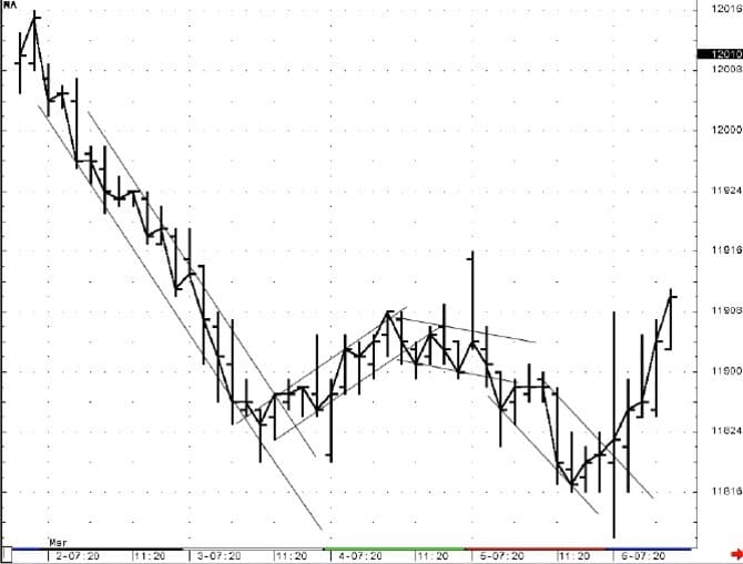
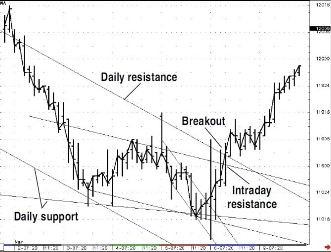
There are numerous technical methods to consider. One would be to use a similar channel analysis on the intraday bars, as applied to the daily bars. Figure 16 shows 40-minute bars for the week of March 2 to March 7 using the June Treasury bond contract. You can follow the same guidelines by establishing three points of reference and projecting forward for the support and resistance points; however, this technique seems to generate a number of false reversals, unless you used this technique only when you are at an important juncture. Let’s use both time frames. In Figure 17, the market has reached the critical support based on the daily bar chart analysis and then broke out of the downward channel on the 40-minute bars, signaling a buy.
- FIGURE 16: JUNE T-BONDS. Here are 40-minute bars for the week of March 2 to March 7 using the same guidelines by establishing three points of reference and projecting forward for the support and resistance points. This technique seems to generate a number of false reversals, unless you only used this technique when you are at an important juncture.
- FIGURE 17: JUNE T-BONDS. The market reached the critical support based on the daily bar chart analysis and then broke out of the downward channel on the 40-minute bars, signaling a buy.
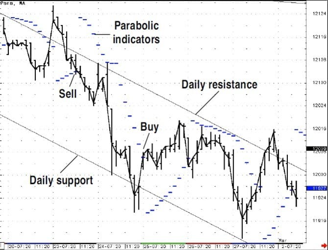
Another approach is to use technical indicators at important junctures from the daily bar chart analysis. Our first example is the parabolic indicator. Figure 18 shows the parabolic indicator applied to the 40-minute bars using a step advance of 0.0382. This is the adjustment factor for the step in the parabolic indicator.
The parabolic indicator is a stop-and-reverse indicator because you are always in the market, moving from a long position to a short position based on crossing the dashed line in Figure 18. The calculation automatically adjusts a trailing stop based on the market action. If the market enters into a swift trend, the indicator will adjust by moving quickly, up to the limit, to catch up with the market. If the market fails to trend, the indicator slows too. If the market passes above a falling parabolic trendline, then the parabolic will switch directions, find the lowest low (called the extreme price) since the last sell signal and start calculating a rising parabolic value. Likewise, the price falling though a rising parabolic indicator will trigger the indicator to start plotting from the highest high since the last sell signal.
- FIGURE 18: JUNE T-BONDS. Here, the parabolic indicator is applied to the 40-minute bars along with the daily channel support and resistance lines. The parabolic indicator is a stop-and-reverse indicator and automatically adjusts a trailing stop based on the market action.
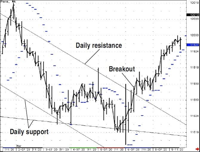
- FIGURE 19: JUNE T-BONDS. A key support level based on the two sets of trend channels shown in Figure 13 indicate a bottom. The parabolic was already long as the resistance from the down trend channel gave way.
In Figure 18, the downtrend channel is plotted based on the daily bars’ channel. You could use the parabolic by taking signals in the same direction as the trend channel and not reversing. However, if you are at a key support level (Figure 19), then you could take countertrend signals or wait till the downtrend channel is passed to the upside. This approach incorporates the trend, and with the parabolic indicator, the last key support or resistance point is the starting point for its calculation, plus providing you with a trailing-stop mechanism.
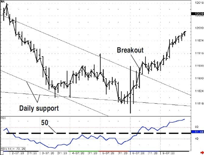
Another possible approach uses momentum. One popular indicator is the relative strength index (RSI). The RSI is best known as an overbought/oversold indicator; high readings indicate an overbought condition and likely reversal, while low readings indicate an oversold condition and a possible bottom in the markets. However, I am of the opinion that the RSI is well-suited to indicating the direction of the market momentum. I set parameters for the 14-bar RSI readings greater than 50 to indicate the trend of momentum is positive, while readings below 50 indicate the trend of momentum is negative. We can apply this analysis in the same fashion. If the market has reached an important support or resistance level, wait for a confimation from the RSI to indicate that the momentum of the intraday trend has changed direction.
Figure 20 shows the 40-minute bars with the 14-period RSI plotted below the price bars. On March 3, the market hit two key levels of support and rallied, but the RSI did not surpass the 50 level. This was an indication that the momentum was still negative. Then on March 9, after hitting support and reversing, the market began a rally that pushed the RSI above 50 and prices finished the day up, closing past the resistance line of the daily downtrend channel.
- FIGURE 20: JUNE T-BONDS. The 40-minute bars with the 14-period RSI are plotted below the price bars. On March 3, the market hit two key levels of support and rallied, but the RSI did not surpass the 50 level. This was an indication that the momentum was still negative. Then on March 9, the market reversed and began a rally that pushed the RSI above 50; prices finished the day closing past the resistance line of the daily downtrend channel.
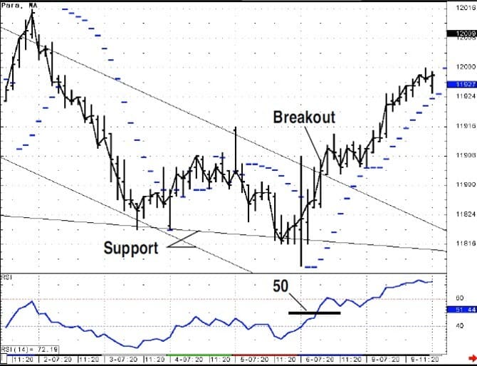
- FIGURE 21: JUNE T-BONDS. Here’s an example of how these various indicators interplay. You could have bought if support held and the RSI moved above 50. The parabolic could be used as a trailing stop. Now, our intraday method is a combina-tion of key price levels, momentum and trend.
The parabolic indicator could also be combined with the 14-period RSI. Figure 21 shows how these various indicators interplay by placing your intraday trades based on the daily support and resistance levels. You could have bought if support held and the RSI moved above 50. The parabolic could have been used as a trailing stop. Our intraday method is a combination of key price levels, momentum and trend. I have always thought that a technical indicator that could monitor the trend of momentum, price levels and trend direction would be invaluable. I finally found such an indicator in the form of the Fibonacci Trader. This product carries an indicator found nowhere else, one called the dynamic trio.
The dynamic trio is part of the technical analysis software designed by trader Robert Krausz. The formula for the indica-tor is proprietary. Normally, this would dissuade me from using the indicator, as I like to know the criteria for calcula-tions, but I’ve followed the performance of this indicator since I wrote the review on it, and I can understand why Krausz has not published the formula. This indicator tracks both the trend and the notable price levels, plus it’s a stop-and-reverse method.
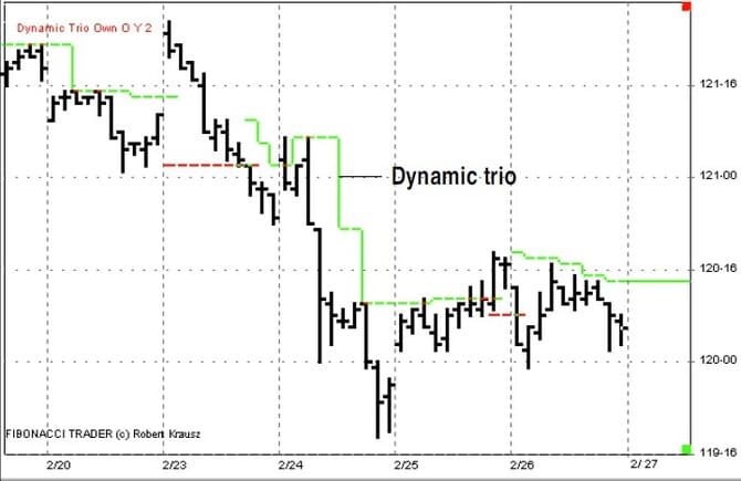
Figure 22 shows the dynamic trio using the June T-bond contract from February 23 to 26, a portion of the period shown in Figure 18. When the market is in a downtrend the indicator tracks the highs, adjusting to the falling prices based on the falling resistance points. This is far superior to any other indicator, such as the parabolic that only uses one resistance point, and then mathematically adjusts itself to the falling prices.
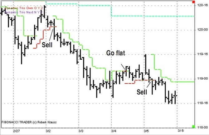
- FIGURE 22: DYNAMIC TRIO. When the market is in a downtrend, the dynamic trio tracks the highs, adjusting to the falling prices based on the falling resistance points. This is far superior to any other indicator, such as the parabolic that only uses one resistance point, and then mathematically adjusts itself to the falling prices.
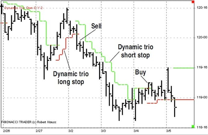
- FIGURE 23: DYNAMIC TRIO. Here is another good example about how the dynamic trio focuses in on the important support and resistance price levels, and the direction of the trend.
This last point is a problem common with indicators. The basis for the calculation of a typical indicator is to reduce noise by smoothing the price action or adjusting to the price movement using a filter such as an average, so we lose sight of the true market movement. The dynamic trio does not lose sight of the important price points in its calculation. In addition, the indicator can be set to require a closing price of any number of ticks past to signal a reversal. This is an insightful approach because markets can have false breaks of support or resistance and put you into a new trend prematurely.
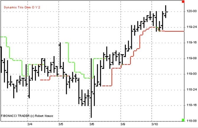
Figure 23 shows the dynamic trio from February 27 through March 4. Here is another good example on how the dynamic trio focuses in on important support and resistance price levels and the direction of the trend. In Figure 24, you can see that after the buy signal on March 6, the dynamic trio indicated important support at the 118-26 level, not back at the low of the move, as indicated in Figure 19 for the parabolic indicator. One feature of the Fibonacci Trader program is the ability to plot indicators from higher time frames. We have been looking at the dynamic trio based on the 40-minute bars. Let’s look at the dynamic trio based on the daily bars shown on the chart of the 40-minute bars as well.
- FIGURE 24: DYNAMIC TRIO. After the buy signal on March 6, the dynamic trio indicated important support at the 118-26 level, not back at the low of the move, as indicated in Figure 19 for the parabolic indicator.
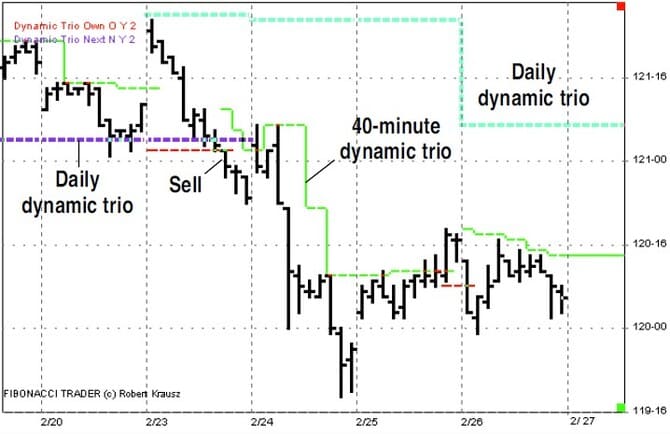
- FIGURE 25: MULTIPLE TIME FRAMES. The dynamic trio, based on the daily bars, can be shown on the chart of the 40-minute bars. Both support lines for the daily and 40-minute dynamic trio are taken out at nearly the same level on February 23. On February 24, the market continues lower, tracked by the 40-minute dynamic trio.
Figure 25 returns to the week beginning February 23, with the dynamic trio on the 40-minute bars and the dynamic trio based on the daily bars plotted on the same chart. I am presenting this because the multiple time frame concept, where I was using the daily bars for trend channels and the 40-minute bars for indicator signals, can be applied here with the guidelines of using the dynamic trio from two time frames, and trading when both indicators agree to the direction of the trend.
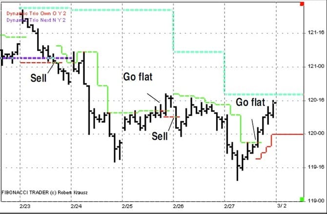
FIGURE 26: JUNE T-BONDS. The daily dynamic trio drops down, and the 40-minute signals to go short. The following day, the market rallies midday and a flat position is signaled.
In Figure 25 both support lines for the daily and 40-minute dynamic trio are taken out at nearly the same level on February 23. On February 24, the market continues lower, tracked by the 40-minute dynamic trio. Then on February 25, the market closes above the 40 minute dynamic trio signaling to go flat. In Figure 26, the daily dynamic trio drops down and the 40-minute signals to go short at the close of the first bar. The next day, the market rallies midday and a flat position is signaled. Then on March 2 (Figure 27), the market trends downward all day, with the 40-minute dynamic trio putting you short early on.
- FIGURE 27: JUNE T-BONDS. On March 2, the market trends downward all day, with the 40-minute dynamic trio putting you short early on.
- FIGURE 28: JUNE T-BONDS. Jumping ahead to March 9, the daily and the 40-minute both signal long positions. You may recall from Figure 21 that the market had hit and reversed from two trend channel lines drawn on the daily charts.
Jumping ahead to March 9 (Figure 28), the daily and the 40-minute both signal long positions. Recall from Figure 21 that the market had hit and reversed from two trend channel lines drawn on the daily charts. At this point, the probability is high that an important bottom was put in by the market.
CONCLUSION
The true power of trend channels is the forecast that is available in their use. You can project possible support and resistance levels and alternative scenarios. The weakness is developing a clear signal for trading. A multiple time frame approach is the solution. Using intraday indicators in concert with the information provided by the daily channels offers a potent combination. I’ve showed three possible indicators for this use, but my favorite remains the dynamic trio.

